resid.inspect <- function(lmm1, col = "black"){
  par(mfrow=c(1,3))
  hist(residuals(lmm1)/sd(residuals(lmm1),na.rm=T),30,main="")
  plot(fitted(lmm1),residuals(lmm1)/sd(residuals(lmm1),na.rm=T),col=col)
  qqnorm(residuals(lmm1)/sd(residuals(lmm1),na.rm=T))
  abline(coef=c(0,1))
  return(residuals(lmm1)/sd(residuals(lmm1),na.rm=T))
  par(mfrow = c(1,1))
}8 Repeated measures and longitudinal data
8.1 Auxiliary functions
You will need the following function to explore the residuals of a linear mixed model (this will produce a result analogous to the plot function for linear models).
8.2 Banana experiment
Let’s load the experiment on banana yields from the lecture:
Irrigation_Data <- read.csv("data/raw/CP8a_irrigation.csv", header = T)As usual, we convert the relevant variables to factors and reorder the levels of the Treatment to make the interpretation of the results easier:
Irrigation_Data$Field <- as.factor(Irrigation_Data$Field)
Irrigation_Data$Treatment <- factor(Irrigation_Data$Treatment,
                                    levels = c("standard","drip"))
We also center the covariate Distance_pipe_cm because of the advantage for estimation when the covariate is centered:
Irrigation_Data$Distance_pipe_cm.sc <- scale(Irrigation_Data$Distance_pipe_cm,
                                             scale = FALSE)
Let’s check the balance in the design:
with(Irrigation_Data,table(Treatment, Field)) Field
Treatment 1 2 3 4 5 6 7 8 9 10
standard 0 0 0 0 0 0 12 12 12 12
drip 12 12 12 12 12 12 0 0 0 0Do we have repeated distance_pipe measurements?
with(Irrigation_Data,sort(unique(Distance_pipe_cm))) [1] 170 210 240 246 247 248 249 254 262 264 265 266 270 272 277 280 282 287 289
[20] 291 292 294 297 299 300 304 305 306 307 308 309 311 313 316 320 324 325 326
[39] 327 328 329 335 340 345 350 359 371 386 388 391 400 415 435 441 446 448 454
[58] 456 458 469 471 472 475 477 480 481 482 487 490 493 494 495 496 497 498 502
[77] 505 506 507 509 510 511 515 516 517 519 521 526 527 528 530 535 537 539 566
[96] 580 581length(unique(Irrigation_Data$Distance_pipe_cm))/nrow(Irrigation_Data)[1] 0.8083333and the difference between the treatments:
library(lattice)
with(Irrigation_Data,plot(yield_kg_ha~ Treatment))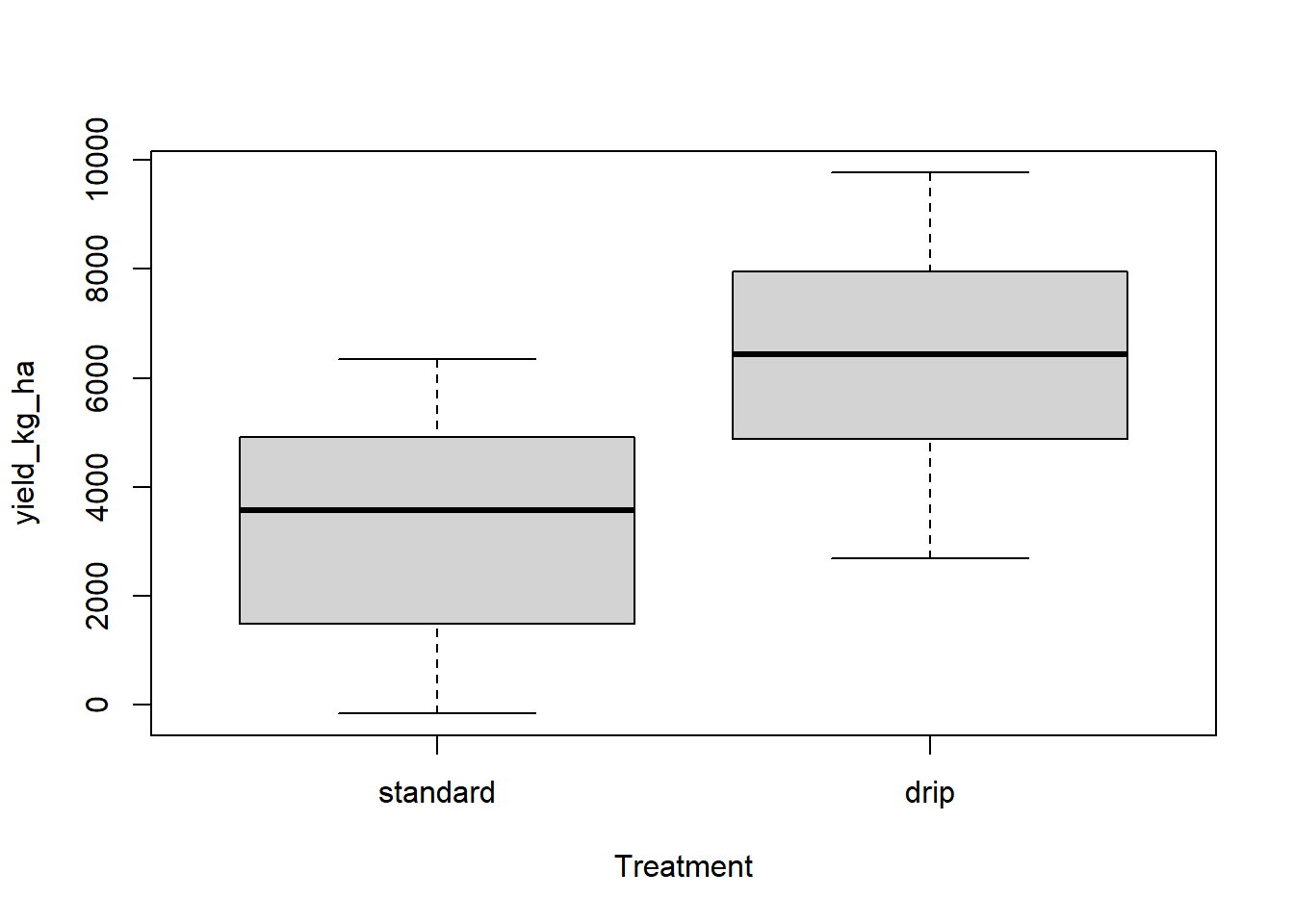
xyplot(yield_kg_ha ~ Distance_pipe_cm.sc | Field, group = Treatment,
       data = Irrigation_Data, auto.key = TRUE, pch = 19, cex = 0.5)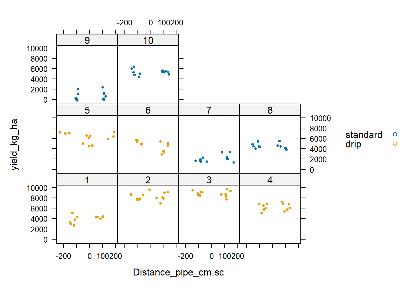
Exercise 8.1
- What do you consider are repeated measures in this experiment?
- Fit a linear model with that includes
Fieldas an additive block effect and the interaction betweenTreatmentandDistance_pipe_cm.sc. - Do the same but without
Field. - Fit a linear mixed model with
Fieldas a random effect and the interaction betweenTreatmentandDistance_pipe_cm.sc. Inspect the residuals using the function provided above and discuss. - Compare all these models (estimates and standard errors of fixed effects, anova tables).
Solution 8.1
In a model that does not include the effect of
Distance_pipe_cm, repeated measures would be all the measurements taken within a field. Once we include the effect ofDistance_pipe_cm(as a covariate), then there are no clear repeated measures as most of the distances are unique. Of course, I could categorize (bin) these distances as they tend to be clustered, in which case I would have repeated measures within those categories.- Let’s fit the models:
lm1 <- lm(yield_kg_ha ~ Treatment * Distance_pipe_cm.sc + Field, data = Irrigation_Data)
lm2 <- lm(yield_kg_ha ~ Treatment * Distance_pipe_cm.sc, data = Irrigation_Data)
library(lme4)
Loading required package: Matrixlibrary(lmerTest)
Attaching package: 'lmerTest'The following object is masked from 'package:lme4':
lmerThe following object is masked from 'package:stats':
steplmm1 <- lmer(yield_kg_ha ~ Treatment * Distance_pipe_cm.sc + (1|Field), data = Irrigation_Data)Let’s inspect the residuals of the linear mixed model:
resid.inspect(lmm1)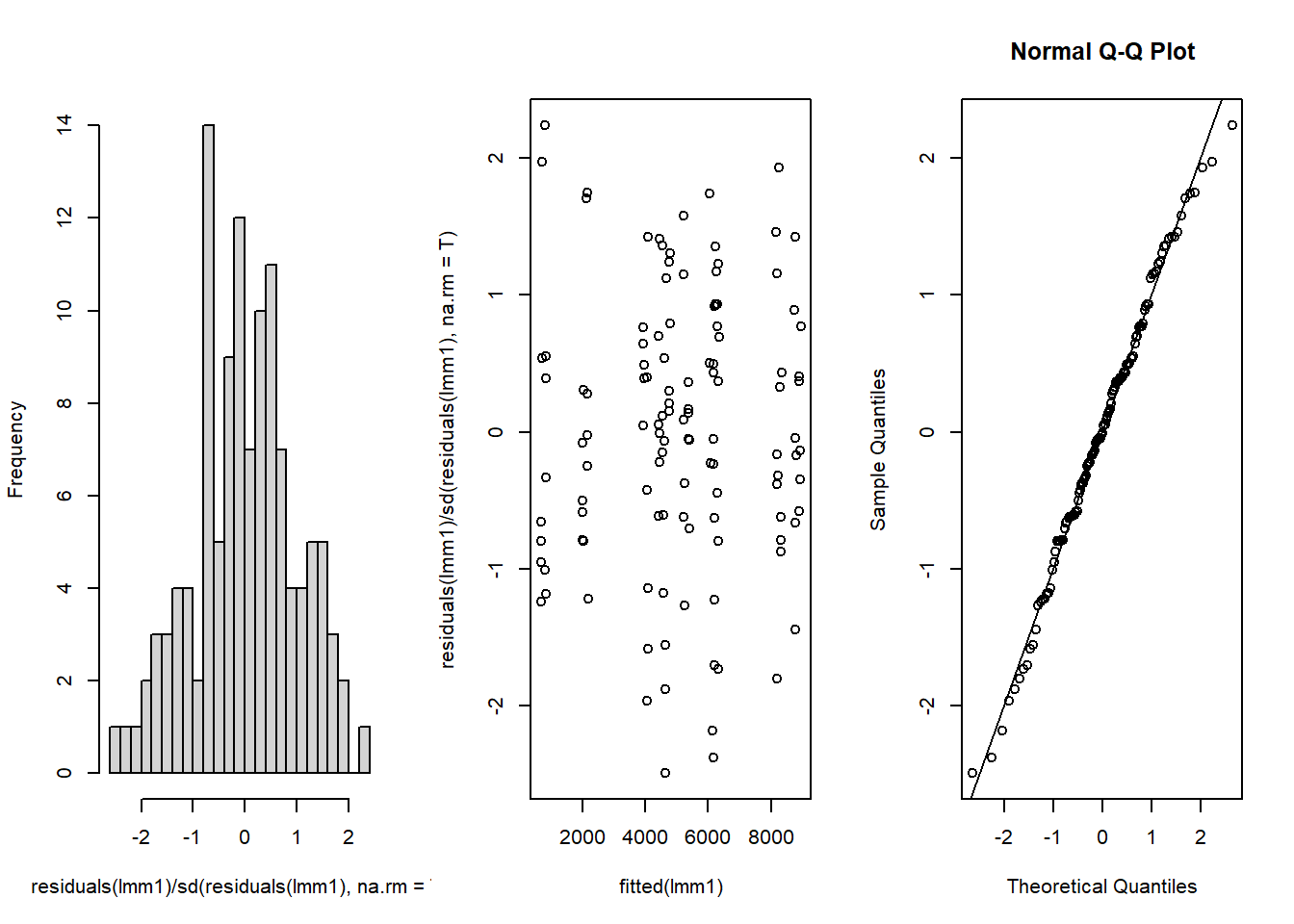
           1            2            3            4            5            6
-1.960841040  0.044547796 -1.579594962  0.492451299  0.400868626  0.641961002
           7            8            9           10           11           12
 1.425426677  0.388096656 -0.427007510  0.763888477 -1.141952796  0.489752157
          13           14           15           16           17           18
-0.790264648 -0.167036288 -0.620187621 -0.379744317  0.436045547 -0.315639744
          19           20           21           22           23           24
 0.331280953  1.458003734 -0.873978681 -1.798930416  1.926347143  1.159403428
          25           26           27           28           29           30
 0.768050860 -0.171238702  0.407867708  1.423429084  0.373133079  0.889986373
          31           32           33           34           35           36
-0.345973568 -0.042462074 -0.580723112 -0.659260290 -0.136721749 -1.445721025
          37           38           39           40           41           42
 0.771689900  1.350758072 -1.729802584  0.932656518 -0.795856728 -0.233613652
          43           44           45           46           47           48
 0.369137713 -0.628601835  0.691808041 -1.223666321 -0.442785687  0.918701026
          49           50           51           52           53           54
 1.168942824  0.436394825 -1.705510097 -0.227566329  0.934831037 -2.181808171
          55           56           57           58           59           60
 0.499293015  0.504093576  1.224397150 -2.380018914 -0.054271144  1.740567472
          61           62           63           64           65           66
 1.242581578 -1.558203202  0.152258022 -0.065073048  0.791998634 -2.491373277
          67           68           69           70           71           72
 0.301895983 -1.875106189  1.305748308  1.124200760  0.211307244  0.536733423
          73           74           75           76           77           78
-0.789651972 -0.248607755  0.303935995  1.745696953 -0.502061285  1.708461401
          79           80           81           82           83           84
-0.588756781 -0.024826670 -0.077580161  0.275765637 -0.797262833 -1.217426724
          85           86           87           88           89           90
 0.056547634  1.362016689 -0.220267849 -1.176035346  0.697679640  0.116930578
          91           92           93           94           95           96
-0.006134581 -0.608980846 -0.613238683 -0.149357667  1.406937082 -0.603315308
          97           98           99          100          101          102
 0.538872746 -0.329381659 -0.657212964 -1.007015203 -0.796970613  2.236557778
         103          104          105          106          107          108
-1.236260388 -1.180285982  1.972903092  0.555335718 -0.951597034  0.387994058
         109          110          111          112          113          114
 1.577774528  0.167075331  0.087840411 -0.053497848 -0.371356712 -0.702575332
         115          116          117          118          119          120
-1.264986708 -0.056952616  1.150864606  0.136928280 -0.620997448  0.366476812
This seems OK. No clear patterns in the residuals and the QQ-plot is close to the 1:1 line.
- Let’s compare the models:
anova(lm1)Analysis of Variance Table
Response: yield_kg_ha
Df Sum Sq Mean Sq F value Pr(>F)
Treatment 1 295276324 295276324 543.0571 <2e-16 ***
Distance_pipe_cm.sc 1 59204 59204 0.1089 0.7421
Field 8 383927820 47990978 88.2625 <2e-16 ***
Treatment:Distance_pipe_cm.sc 1 552552 552552 1.0162 0.3157
Residuals 108 58722822 543730
---
Signif. codes: 0 '***' 0.001 '**' 0.01 '*' 0.05 '.' 0.1 ' ' 1anova(lm2)Analysis of Variance Table
Response: yield_kg_ha
Df Sum Sq Mean Sq F value Pr(>F)
Treatment 1 295276324 295276324 77.3968 1.537e-14 ***
Distance_pipe_cm.sc 1 59204 59204 0.0155 0.9011
Treatment:Distance_pipe_cm.sc 1 652175 652175 0.1709 0.6800
Residuals 116 442551019 3815095
---
Signif. codes: 0 '***' 0.001 '**' 0.01 '*' 0.05 '.' 0.1 ' ' 1anova(lmm1, ddf = "Kenward-Roger")Type III Analysis of Variance Table with Kenward-Roger's method
Sum Sq Mean Sq NumDF DenDF F value Pr(>F)
Treatment 3325501 3325501 1 7.999 6.1161 0.03853 *
Distance_pipe_cm.sc 620 620 1 108.052 0.0011 0.97313
Treatment:Distance_pipe_cm.sc 526551 526551 1 108.052 0.9684 0.32728
---
Signif. codes: 0 '***' 0.001 '**' 0.01 '*' 0.05 '.' 0.1 ' ' 1Across all models, the interaction between Treatment and Distance_pipe_cm is not significant and neither is the main effect of Distance_pipe_cm. That makes sense as the slopes of yield vs distance in the plot above were practically zero in all cases. We do see a significant effect of the Treatment, though the strength of that significance is weaker in the linear mixed model.
Let’s compare the estimates and standard errors of the fixed effects (I remove the effects of the fields in the first linear model):
summary(lm1)$coefficients[c(1:3, 12),1:2] Estimate Std. Error
(Intercept) 5336.1938828 212.8855399
Treatmentdrip -1369.1861990 301.7517450
Distance_pipe_cm.sc 0.6331754 0.9881389
Treatmentdrip:Distance_pipe_cm.sc -1.3028425 1.2924001summary(lm2)$coefficients[,1:2] Estimate Std. Error
(Intercept) 3169.993835 281.924125
Treatmentdrip 3201.898650 363.962449
Distance_pipe_cm.sc -1.024188 2.585842
Treatmentdrip:Distance_pipe_cm.sc 1.400640 3.387639summary(lmm1)$coefficients[,1:2] Estimate Std. Error
(Intercept) 3169.830011 1002.9039010
Treatmentdrip 3201.993532 1294.7433675
Distance_pipe_cm.sc 0.614056 0.9880026
Treatmentdrip:Distance_pipe_cm.sc -1.271749 1.2922462We can see that none of the models agree on the estimates and standard errors of the fixed effets. Interesting, the estimate of intercept and Treatment for the mixed effect model coincide with the linear model without a Field effect (but the standard errors are larger in the mixed mdoel), whereas the effects and interactions involving Distance_pipe_cm are very close to the estimates from the linear model that corrects for Field (including the standard errors).
8.3 Bivariate data
Let’s load the data on maize that was discussed in the lecture:
multi.trait.data<-read.csv("data/raw/CP8a_maize_MT.csv",header=T)And visualize it to learn about the structure of the design:
with(multi.trait.data, table(block, genotype)) genotype
block 1 2 3 4 5 6 7 8 9 10 11 12 13 14 15 16 17 18 19 20 21 22 23 24 25 26 27
1 2 2 2 2 2 2 2 2 2 2 2 2 2 2 2 2 2 2 2 2 2 2 2 2 2 2 2
2 2 2 2 2 2 2 2 2 2 2 2 2 2 2 2 2 2 2 2 2 2 2 2 2 2 2 2
3 2 2 2 2 2 2 2 2 2 2 2 2 2 2 2 2 2 2 2 2 2 2 2 2 2 2 2
4 2 2 2 2 2 2 2 2 2 2 2 2 2 2 2 2 2 2 2 2 2 2 2 2 2 2 2
5 2 2 2 2 2 2 2 2 2 2 2 2 2 2 2 2 2 2 2 2 2 2 2 2 2 2 2
genotype
block 28 29 30
1 2 2 2
2 2 2 2
3 2 2 2
4 2 2 2
5 2 2 2par(mfrow=c(1,1))
plot(with(multi.trait.data, table(block, genotype)),main="")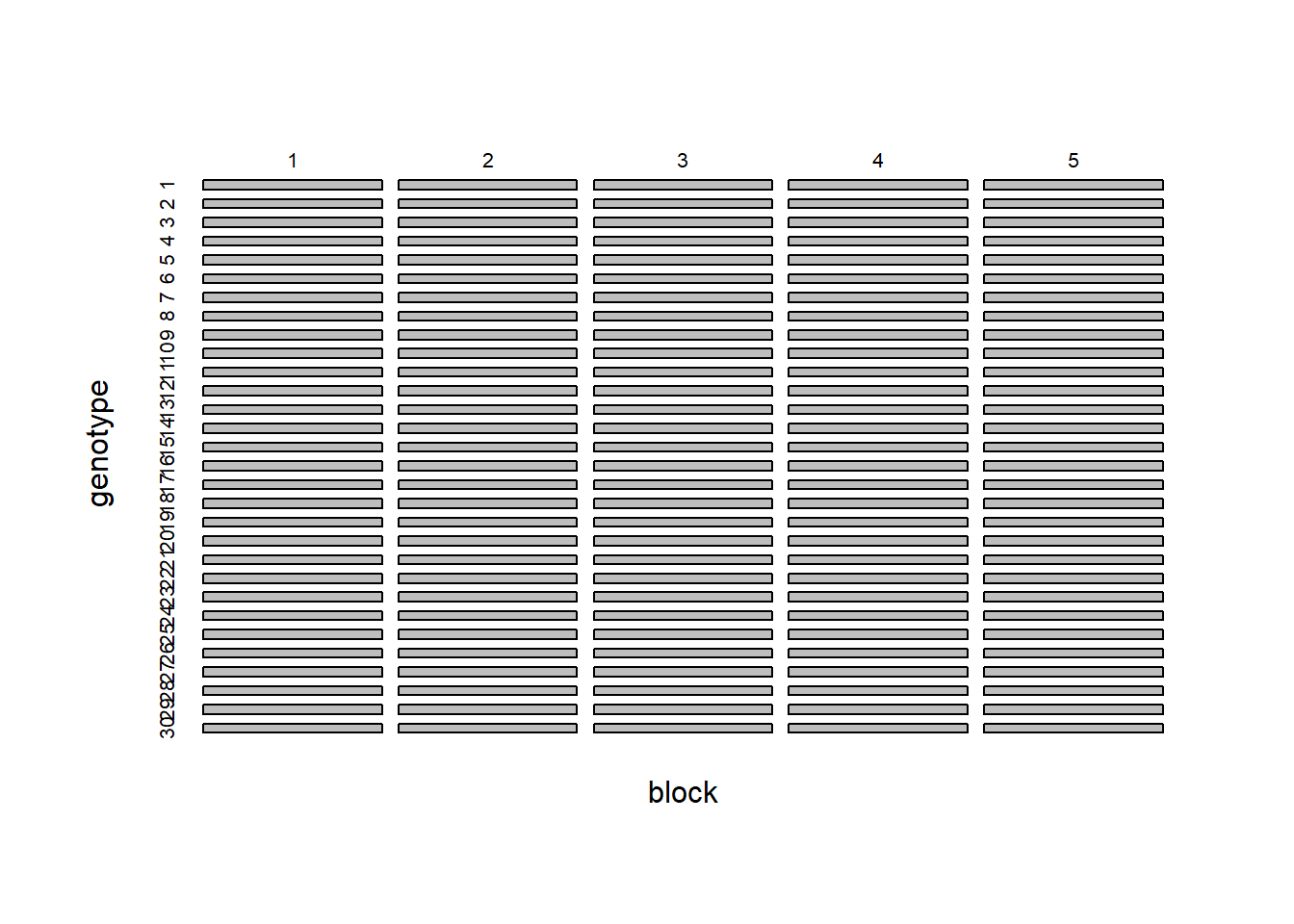
We see that we have 30 genotypes and 5 blocks and the design is balanced. The data is stored in long format, meaning that instead of having one column per trait, we have one column that defines the trait being measured and another column with the values of that trait:
head(multi.trait.data) genotype plots block time value trt
1 8 101 1 1 2.306920 1
2 6 102 1 1 1.441008 1
3 26 103 1 1 1.843735 1
4 19 104 1 1 2.304537 1
5 5 105 1 1 1.687683 1
6 17 106 1 1 2.801778 1This will allows us to fit a model that predicts the values of both traits while still having a single response variable, by including the trait as a factor in the model. Let’s fit a mixed effect model where we treat the genotype as a random effect but the block as a fixed effect:
lmm1 <- lmer(value~ block*trt +(trt -1|genotype), data = multi.trait.data)
summary(lmm1)
Linear mixed model fit by REML. t-tests use Satterthwaite's method [
lmerModLmerTest]
Formula: value ~ block * trt + (trt - 1 | genotype)
Data: multi.trait.data
REML criterion at convergence: 3127.8
Scaled residuals:
Min 1Q Median 3Q Max
-2.24384 -0.51110 -0.04967 0.41442 2.89199
Random effects:
Groups Name Variance Std.Dev.
genotype trt 596.7 24.43
Residual 1690.3 41.11
Number of obs: 300, groups: genotype, 30
Fixed effects:
Estimate Std. Error df t value Pr(>|t|)
(Intercept) -231.063 17.603 267.000 -13.126 < 2e-16 ***
block 10.127 5.308 267.000 1.908 0.05745 .
trt 233.418 11.993 285.867 19.462 < 2e-16 ***
block:trt -10.217 3.357 267.000 -3.044 0.00257 **
---
Signif. codes: 0 '***' 0.001 '**' 0.01 '*' 0.05 '.' 0.1 ' ' 1
Correlation of Fixed Effects:
(Intr) block trt
block -0.905
trt -0.881 0.797
block:trt 0.858 -0.949 -0.840The problem with this model is that it does not account for the fact that we are measuring two traits on the same plants. That is, this is an example of paired data and therefore we expect the values of the two traits to be correlated. This would be a correlation in the residual covariance matrix (not the random effect covariance matrix) but lmer() does not support this. Instead, we have to use lme() with a suitable covariance matrix.
Exercise 8.2
- Based on the slides from the lecture, fit a linear mixed model using
lme()and a suitable covariance matrix and inspect the results and compared them to the model above.
Solution 8.2
- We need to specify a variance structure (because the measurement error will differ per measured trait) as well as a correlation structure because we expect the two traits to be correlated. We will use the
corSymmcorrelation structure and thevarIdentvariance structure. Note that the variableplotsreally refer to the observation units per combination of block and genotype, so they are nested within genotype.
library(nlme)
Attaching package: 'nlme'The following object is masked from 'package:lme4':
lmListweights = varIdent(form=~1|trt)
corr = corSymm(form=~1|genotype/plots)
lmm2 <- lme(value~ block*trt,random =~ trt-1|genotype, data = multi.trait.data,
weights = weights, corr = corr)Let’s now compare the models. First the variance components:
VarCorr(lmm1) Groups Name Std.Dev.
genotype trt 24.427
Residual 41.113 VarCorr(lmm2)genotype = pdLogChol(trt - 1)
Variance StdDev
trt 0.07294389 0.2700813
Residual 0.12465003 0.3530581We can see that the variance components are very different. When the correlation and the heterogeneity of the variance is accounted for, the variance of the random effect is much smaller. Similarly, the variance of the residual is also much smaller in the second model:
sigma(lmm1)[1] 41.11275sigma(lmm2)[1] 0.3530581Notice that the residual standard deviation in the second model refers to the first trait, whereas the second trait has a much higher residual variation. We can see that when looking at the variance function estimated by lme():
summary(lmm2)Linear mixed-effects model fit by REML
Data: multi.trait.data
AIC BIC logLik
1787.783 1817.306 -885.8915
Random effects:
Formula: ~trt - 1 | genotype
trt Residual
StdDev: 0.2700813 0.3530581
Correlation Structure: General
Formula: ~1 | genotype/plots
Parameter estimate(s):
Correlation:
1
2 0.777
Variance function:
Structure: Different standard deviations per stratum
Formula: ~1 | trt
Parameter estimates:
1 2
1.0000 224.4506
Fixed effects: value ~ block * trt
Value Std.Error DF t-value p-value
(Intercept) -231.06326 15.069252 267 -15.333426 0.0000
block 10.12748 4.543550 267 2.228978 0.0266
trt 233.41825 15.121691 267 15.435989 0.0000
block:trt -10.21688 4.559337 267 -2.240869 0.0259
Correlation:
(Intr) block trt
block -0.905
trt -1.000 0.905
block:trt 0.905 -1.000 -0.905
Standardized Within-Group Residuals:
Min Q1 Med Q3 Max
-2.25354319 -0.69405210 -0.03167296 0.65627952 2.61499487
Number of Observations: 300
Number of Groups: 30 8.4 Estrous cycles of mares
The dataset of estrous cycles of mares is available in the nlme package. Let’s load it:
data(Ovary)And take a look at the data (we can add a smooth trend line to get a first impression of the overall trend of the data):
library(ggplot2)
ggplot(Ovary, aes(x= Time, y= follicles)) +
    geom_point() +
    geom_smooth(se = FALSE) +
    facet_wrap(~Mare)
`geom_smooth()` using method = 'loess' and formula = 'y ~ x'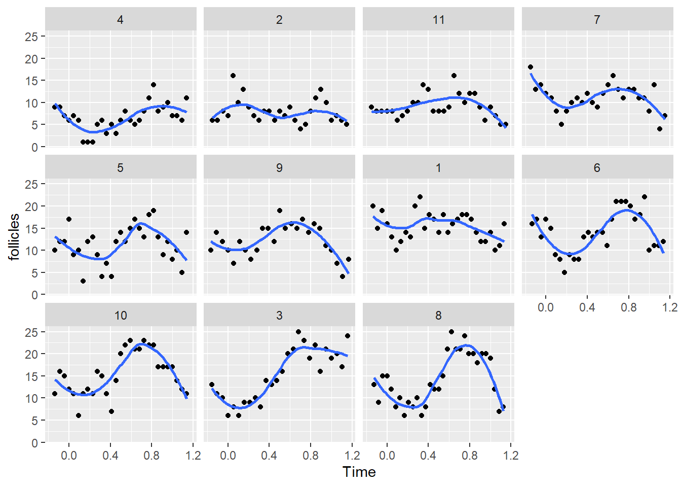
We can see that in most mares there is a clear pattern of oscillation in the number of follicles. Even though this is a non-linear pattern we can still fit a linear (mixed) model as long as the coefficients are linear with respect to the response variable. That is, we could fit this model:
lm1 <- lm(follicles ~ Mare + sin(2*pi*Time) + cos(2*pi*Time), data = Ovary)
summary(lm1)
Call:
lm(formula = follicles ~ Mare + sin(2 * pi * Time) + cos(2 *
    pi * Time), data = Ovary)

Residuals:
    Min      1Q  Median      3Q     Max
-8.4762 -2.2591 -0.3989  2.0225 11.9290

Coefficients:
                   Estimate Std. Error t value Pr(>|t|)
(Intercept)        12.18089    0.20209  60.274  < 2e-16 ***
Mare.L              9.07442    0.63826  14.218  < 2e-16 ***
Mare.Q             -2.95023    0.63551  -4.642 5.19e-06 ***
Mare.C             -1.23790    0.63320  -1.955  0.05153 .
Mare^4             -0.44580    0.64565  -0.690  0.49044
Mare^5              0.06760    0.64646   0.105  0.91679
Mare^6              0.06575    0.65457   0.100  0.92006
Mare^7             -0.54115    0.64301  -0.842  0.40070
Mare^8             -0.32178    0.65093  -0.494  0.62143
Mare^9              1.52254    0.63910   2.382  0.01784 *
Mare^10             1.02652    0.65064   1.578  0.11571
sin(2 * pi * Time) -3.33961    0.28940 -11.540  < 2e-16 ***
cos(2 * pi * Time) -0.86212    0.27160  -3.174  0.00166 **
---
Signif. codes:  0 '***' 0.001 '**' 0.01 '*' 0.05 '.' 0.1 ' ' 1

Residual standard error: 3.4 on 295 degrees of freedom
Multiple R-squared:  0.5625,    Adjusted R-squared:  0.5447
F-statistic:  31.6 on 12 and 295 DF,  p-value: < 2.2e-16
Effectively, we are transforming the variable Time into two new variables that include the non-linearity in the transformation. The coefficient for the cosine term is much smaller so the dynamics are mostly dominated by the sine term. Let’s now do linear mixed model versions of this model with random effects for the intercept (we will use nlme for this because later we will add correlation to the residuals)
lmm1 <- lme(follicles ~ sin(2*pi*Time) + cos(2*pi*Time), random = ~1| Mare, data = Ovary)
summary(lmm1)
Linear mixed-effects model fit by REML
Data: Ovary
AIC BIC logLik
1669.36 1687.962 -829.6802
Random effects:
Formula: ~1 | Mare
(Intercept) Residual
StdDev: 3.041344 3.400466
Fixed effects: follicles ~ sin(2 * pi * Time) + cos(2 * pi * Time)
Value Std.Error DF t-value p-value
(Intercept) 12.182244 0.9390009 295 12.973623 0.0000
sin(2 * pi * Time) -3.339612 0.2894013 295 -11.539727 0.0000
cos(2 * pi * Time) -0.862422 0.2715987 295 -3.175353 0.0017
Correlation:
(Intr) s(*p*T
sin(2 * pi * Time) 0.00
cos(2 * pi * Time) -0.06 0.00
Standardized Within-Group Residuals:
Min Q1 Med Q3 Max
-2.4500138 -0.6721813 -0.1349236 0.5922957 3.5506618
Number of Observations: 308
Number of Groups: 11 We can also create a model where the amplitude of the sine wave (effectively we are indicating that the amplitude of the oscillation is different for each mare):
lmm2 <- lme(follicles ~ sin(2*pi*Time) + cos(2*pi*Time),
            random = pdDiag(Mare~sin(2*pi*Time)), data = Ovary)
summary(lmm2)
Linear mixed-effects model fit by REML
Data: Ovary
AIC BIC logLik
1638.082 1660.404 -813.0409
Random effects:
Formula: Mare ~ sin(2 * pi * Time) | Mare
Structure: Diagonal
(Intercept) sin(2 * pi * Time) Residual
StdDev: 3.052136 2.079312 3.112854
Fixed effects: follicles ~ sin(2 * pi * Time) + cos(2 * pi * Time)
Value Std.Error DF t-value p-value
(Intercept) 12.182024 0.9386620 295 12.978073 0e+00
sin(2 * pi * Time) -3.298537 0.6807030 295 -4.845780 0e+00
cos(2 * pi * Time) -0.862373 0.2486269 295 -3.468541 6e-04
Correlation:
(Intr) s(*p*T
sin(2 * pi * Time) 0.000
cos(2 * pi * Time) -0.055 0.000
Standardized Within-Group Residuals:
Min Q1 Med Q3 Max
-2.68390249 -0.55894622 -0.06689417 0.53639263 4.10778599
Number of Observations: 308
Number of Groups: 11 Let’s compare the two mixed effect models:
anova(lmm1, lmm2) Model df AIC BIC logLik Test L.Ratio p-value
lmm1 1 5 1669.360 1687.962 -829.6802
lmm2 2 6 1638.082 1660.404 -813.0409 1 vs 2 33.27856 <.0001Clearly adding a random effect for the coefficient of the sine term improves the model. Let’s compare the models to the data:
Ovary$fit1 <- fitted(lmm1)
Ovary$fit2 <- fitted(lmm2)
ggplot(Ovary, aes(x= Time, y= follicles)) +
    geom_point() +
    geom_line(aes(y=fit1), color = "red") +
    geom_line(aes(y=fit2), color = "blue") +
    facet_wrap(~Mare)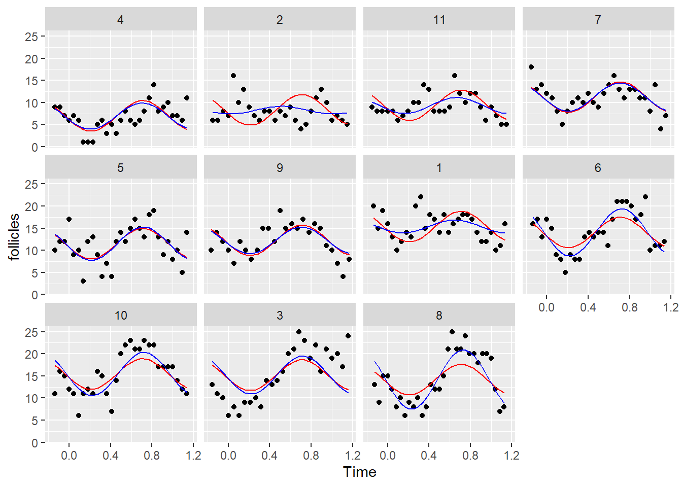
Indeed the predictions with the second model are much better. Now, let’s look at the residuals of the second model:
resid.inspect(lmm2)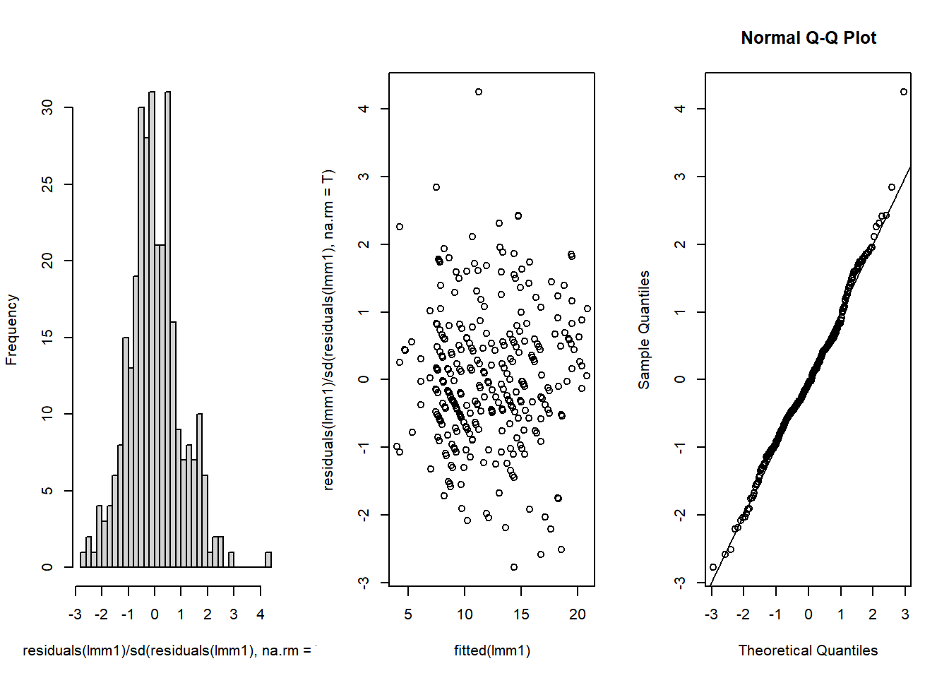
           1            1            1            1            1            1
 1.424979744 -0.100761963  1.361678947  0.484318983 -0.416258625 -1.347863375
           1            1            1            1            1            1
-0.654167081  0.000853038 -0.378997289  1.865704909  2.421345853 -0.032542928
           1            1            1            1            1            1
 0.828549155  0.363082541 -0.753506228  0.479396282 -0.915272745 -0.279669789
           1            1            1            1            1            1
 0.062284529  0.442134856  0.523706344  0.300390213 -0.568969130 -1.097736400
           1            1            1            1            1            2
-0.964594598 -0.180330642 -1.413232250 -1.015538668  0.675132255 -0.616982319
           2            2            2            2            2            2
-0.547326872  0.165908950 -0.143654872  2.841976221  0.815199957  1.755025208
           2            2            2            2            2            2
 0.349849135 -0.401977597 -0.824246299 -0.243503011 -0.313158458 -1.026394279
           2            2            2            2            2            2
-0.384505645 -0.711538239 -0.014061225 -0.953886475 -1.542659277 -1.123157357
           2            2            2            2            2            2
-0.036239030  1.044641743  1.778946815  0.830558574 -0.475979684 -0.148947090
           2            2            3            3            3            3
-0.514099292 -0.903573291 -1.753852686 -2.036474927 -1.917951631 -2.776439623
           3            3            3            3            3            3
-1.672034977 -1.975639863 -0.735456582 -0.636438033 -0.360015756 -1.229431090
           3            3            3            3            3            3
 0.433078461 -0.321441805 -0.456318703 -0.253247720  0.670115202  0.696135538
           3            3            3            3            3            3
 1.851955219  1.165449499 -0.031713460  1.237070625 -0.374850865  1.737621126
           3            3            3            3            4            4
 1.543782937  2.315866025  1.679931903  4.249416597  0.148237865  0.406820735
           4            4            4            4            4            4
 0.022997177 -0.029009500  0.560415805  0.441145085 -1.068731792 -0.990584797
           4            4            4            4            4            4
-0.992369326  0.255358436  0.432933581 -0.779432451 -0.373365697 -1.318841700
           4            4            4            4            4            4
-0.602185086 -0.194635692 -1.072339671 -1.556411668 -1.302233851 -0.635799697
           4            4            4            4            4            4
 0.442746228  1.594470332 -0.184086947  0.406820735  1.019971927  0.303315313
           4            4            4            5            5            5
 0.560418164  0.441144678  2.254517357 -1.233463029 -0.253748933  0.095059340
           5            5            5            5            5            5
 2.110976780 -0.216545985  0.396815127 -1.721229773  1.388245884  1.739841696
           5            5            5            5            5            5
 0.328970959 -1.508458299 -0.767280807 -2.079319717  0.230470117  0.540826756
           5            5            5            5            5            5
-0.454898262  0.261039535  0.717460373 -0.065741598 -0.749662222  0.993533328
           5            5            5            5            5            5
 1.501663336 -0.236488592 -1.250723370  0.095059732 -0.879946531  0.115781899
           5            5            6            6            6            6
-1.264809481  1.934344621 -0.496370726  0.266302158 -0.575431537  1.259150649
           6            6            6            6            6            6
 1.076566319 -0.497588976 -0.506401401 -1.302352844  0.089193471 -0.324702829
           6            6            6            6            6            6
-0.543484091  0.779872377  0.681849117 -0.138041803 -0.310999374 -0.793064165
           6            6            6            6            6            6
-2.209832685 -0.539396198  0.588880058  0.526632991  0.608204480  0.494660929
           6            6            6            6            6            6
-0.164045914  0.598626971  2.415492327 -1.067123037 -0.252728405  0.167059820
           6            7            7            7            7            7
 0.822900188  1.588131998  0.214680362  0.870938827  0.534275200  0.501883175
           7            7            7            7            7            7
-0.252571196 -1.088177841 -0.026783691  0.599031718  0.793069749  0.236542064
           7            7            7            7            7            7
 0.613019264 -0.375564014 -1.035874824 -0.338833174  0.083296384  0.586578217
           7            7            7            7            7            7
-0.474815933 -1.100631342 -0.297694936 -0.073492064 -0.449969263 -0.126035610
           7            7            7            7            8            8
-0.795024050  1.498857612 -1.581870445 -0.423528216 -1.758587212 -2.584537992
           8            8            8            8            8            8
-0.028834579  0.553043647  0.118416948 -0.706388237  0.370521577 -0.666846182
           8            8            8            8            8            8
 0.481835848  0.150656815  0.665811786 -0.953433871 -0.699424391  0.458850813
           8            8            8            8            8            8
-0.435227734 -1.017106376 -0.582480066  0.906975465  1.824014192  0.202783452
           8            8            8            8            8            8
 0.051075860  1.046904517 -0.132900079  0.157046329 -0.096963151  1.071035332
           8            8            8            8            8            9
 1.632789066  1.882342896  0.118421222 -1.038716721 -0.294128048 -1.447695952
           9            9            9            9            9            9
 0.174079553 -0.149477550 -0.465558756 -1.148531498  0.754654221  0.229990542
           9            9            9            9            9            9
-0.413133481  0.151985169  1.605026915  1.312550659 -0.025516047  1.952188968
           9            9            9            9            9            9
 0.308887820  0.399651179 -0.072659579  0.570464444 -0.326979018  0.546252922
           9            9            9            9            9            9
 0.506404365 -0.481802615 -0.465558756 -1.148529253 -1.903944628 -0.434658638
          10           10           10           10           10           10
-2.507745363 -0.448471974 -0.332587994 -0.867105786 -0.760191597 -2.041378839
          10           10           10           10           10           10
-0.088941136  0.421014906  0.138747538  1.718800112  1.179883659 -0.464291420
          10           10           10           10           10           10
-2.191239996 -0.313175611  1.218317126  1.443728207  1.395615743  0.440152476
          10           10           10           10           10           10
 0.262521247  0.877113427  0.626360103  0.832951743 -0.513796489 -0.116147162
          10           10           10           10           10           11
 0.332062139  0.794518276  0.236786953 -0.047430714 -0.088939047 -0.378639108
          11           11           11           11           11           11
-0.531083459 -0.343605642 -0.166882104 -0.018211776 -0.576797170 -0.191396530
          11           11           11           11           11           11
 0.135820274  0.737678063  0.623348902  1.797973000  1.285767727 -0.563334152
          11           11           11           11           11           11
-0.740057690 -0.888728019 -0.662467437  1.610730422  0.286539181 -0.315318608
          11           11           11           11           11           11
 0.463660178  0.618335329 -0.198758647 -1.008255267  0.165442708 -0.350536588
          11           11
-0.909121982 -0.856046155
attr(,"label")
[1] "Residuals"
Everything looks reasonable. However, if we plot the residuals against time:
ggplot(Ovary, aes(x= Time, y= residuals(lmm2))) +
    geom_point() +
    geom_smooth(se = FALSE) +
    geom_hline(yintercept = 0) +
    facet_wrap(~Mare)
`geom_smooth()` using method = 'loess' and formula = 'y ~ x'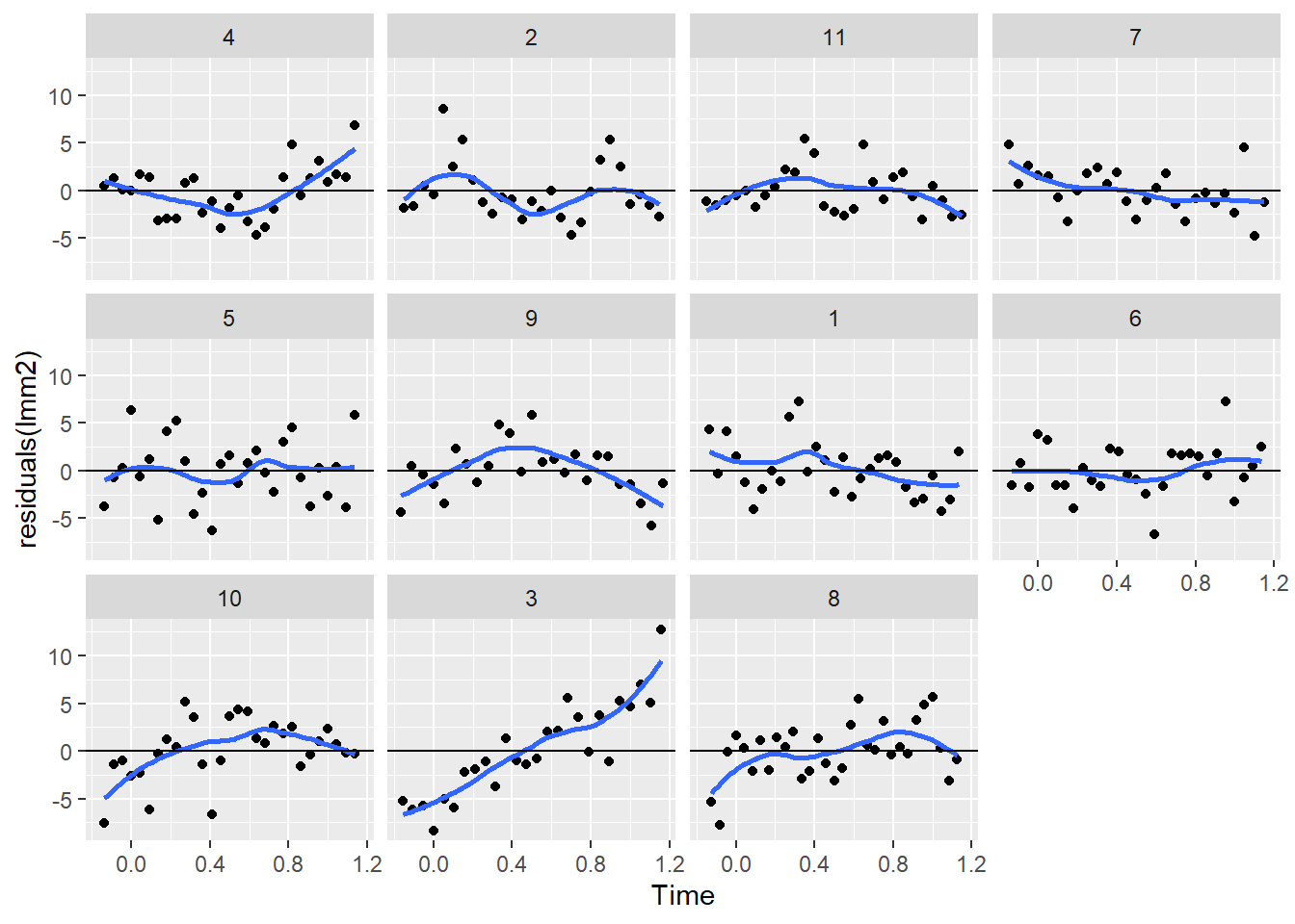
We can see a clear pattern in the residuals. This indicates a temporal correlation in the residuals. That is, the residuals of the model from timepoints that are close tend to have the same sign and similar magnitude. This is know as auto-correlation in a times series and can be quantify with an acf plot:
par(mfrow = c(1,1))
plot(0.045*(1:10), ACF(lmm2, maxLag = 10)[-1,2], xlab = "time", t = "h")
abline(h = 0)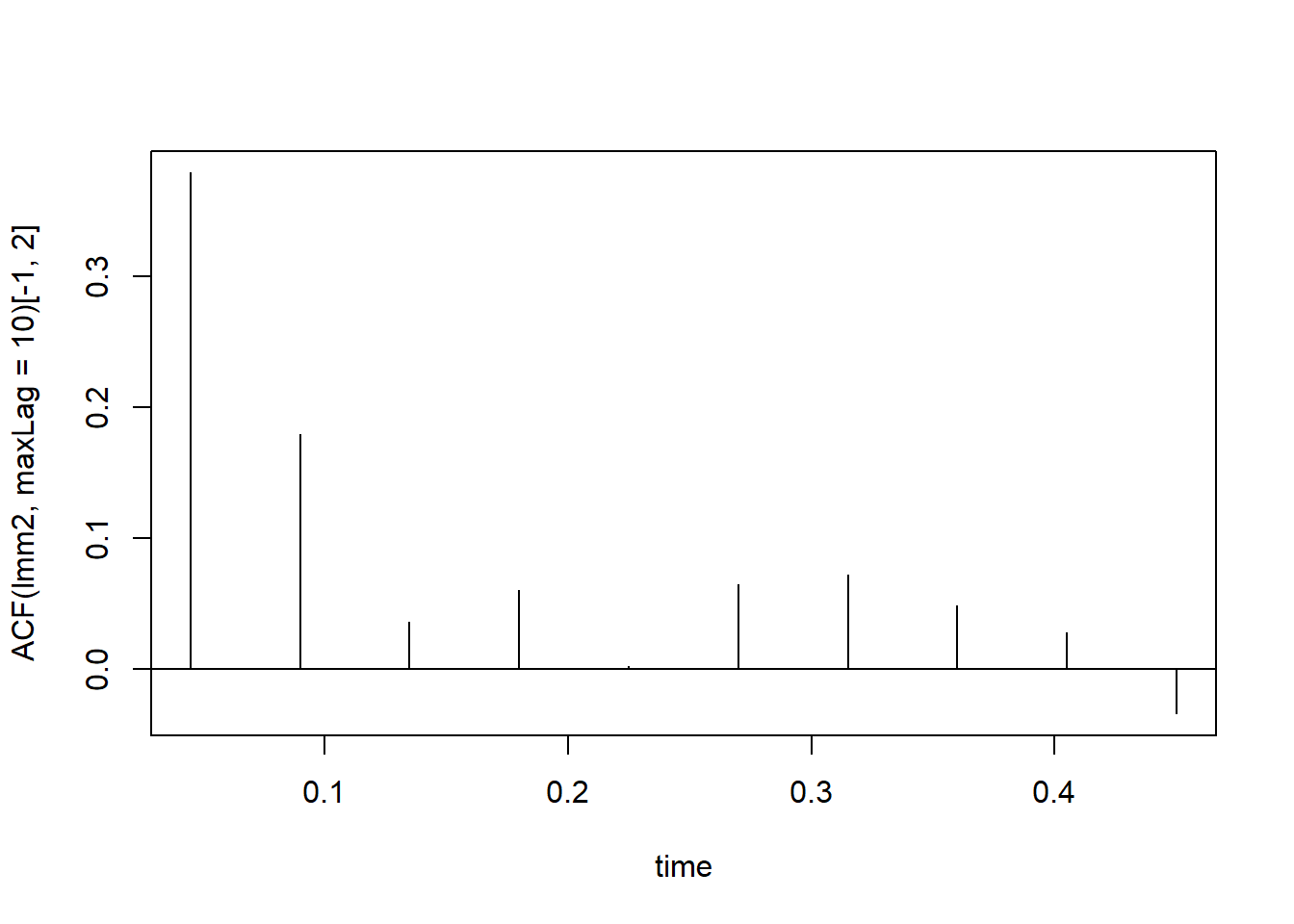
This analysis shows that observations that are less than 0.1 units of time apart are somewhat correlated and cannot be assumed independent. Also, as is usually the case in auto-correlated data, the strength of the correlation decreases as the observations are further apart. This requires constructing a special type of matrix where the correlation between residuals is modeled as a function of their distance within the time series. The package nlme offer different pre-built auto-correlation models that could be used:
Let’s look at the AR1 correlation model.:
cs1AR1 <- corCAR1(0.5,form = ~ x)
cs1AR1 <- Initialize(cs1AR1,data=data.frame(x=c(0,1,2,4,8)))
corMatrix(cs1AR1)
[,1] [,2] [,3] [,4] [,5]
[1,] 1.00000000 0.5000000 0.250000 0.0625 0.00390625
[2,] 0.50000000 1.0000000 0.500000 0.1250 0.00781250
[3,] 0.25000000 0.5000000 1.000000 0.2500 0.01562500
[4,] 0.06250000 0.1250000 0.250000 1.0000 0.06250000
[5,] 0.00390625 0.0078125 0.015625 0.0625 1.00000000This model assumes a correlation of rho = 0.5 between observations that are one unit of time apart and as we move further apart the correlation decreases at the rate rho^x:
cbind(corMatrix(cs1AR1)[2:5,1],0.5^c(1,2,4,8)) [,1] [,2]
[1,] 0.50000000 0.50000000
[2,] 0.25000000 0.25000000
[3,] 0.06250000 0.06250000
[4,] 0.00390625 0.00390625For a time lag of up to 10 this would like:
curve(0.5^x,from=0,to=10)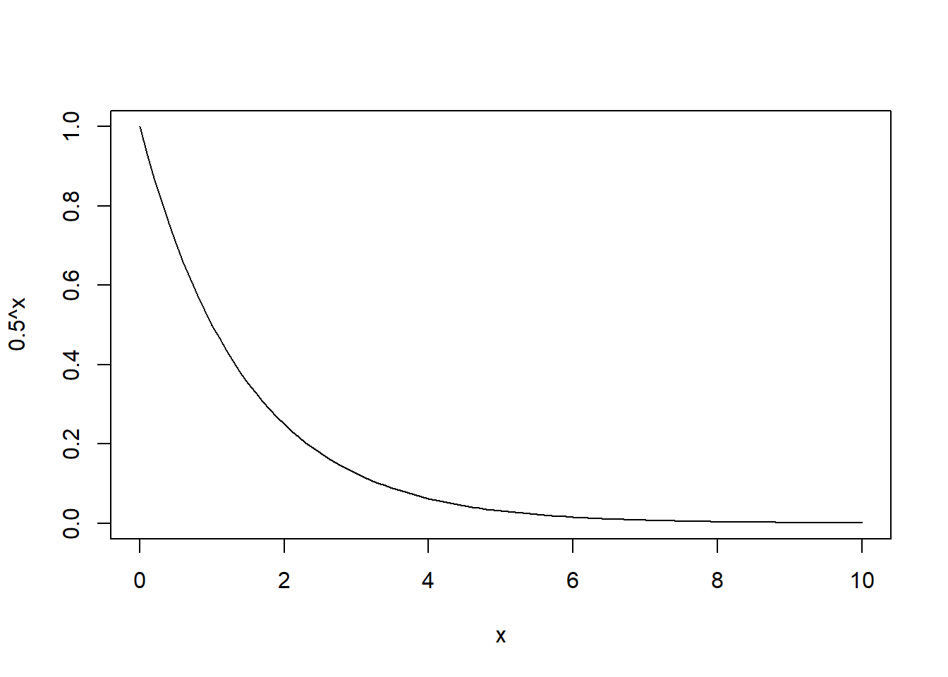
An alternative correlation structure would be a linear model:
cs1AR1 <- corLin(4,form = ~ x)
cs1AR1 <- Initialize(cs1AR1,data=data.frame(x=c(0:4)))
corMatrix(cs1AR1)
[,1] [,2] [,3] [,4] [,5]
[1,] 1.00 0.75 0.50 0.25 0.00
[2,] 0.75 1.00 0.75 0.50 0.25
[3,] 0.50 0.75 1.00 0.75 0.50
[4,] 0.25 0.50 0.75 1.00 0.75
[5,] 0.00 0.25 0.50 0.75 1.00This model assumes a linear decrease in correlation with time (1 - x/4) but never becomes negative. This looks as follows:
curve(pmax(1 - x/4, 0),from = 0,to = 10)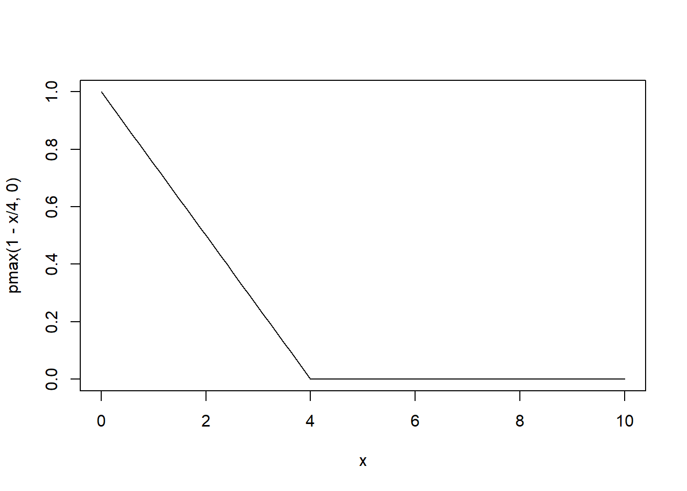
We can specify these correlation structures in the lme() function:
lmm2.car <- lme(follicles ~ sin(2*pi*Time) + cos(2*pi*Time),
            random = pdDiag(Mare~sin(2*pi*Time)), correlation = corCAR1(), data = Ovary)
lmm2.lin <- lme(follicles ~ sin(2*pi*Time) + cos(2*pi*Time),
            random = pdDiag(Mare~sin(2*pi*Time)), correlation = corLin(), data = Ovary)
Let’s compare the models:
anova(lmm2, lmm2.car, lmm2.lin) Model df AIC BIC logLik Test L.Ratio p-value
lmm2 1 6 1638.082 1660.404 -813.0409
lmm2.car 2 7 1563.448 1589.490 -774.7240 1 vs 2 76.63382 <.0001
lmm2.lin 3 7 1589.251 1615.293 -787.6256 The AR1 model is the best. Does this matter for predictions?
Ovary$fit2.car <- fitted(lmm2.car)
ggplot(Ovary, aes(x= Time, y= follicles)) +
    geom_point() +
    geom_line(aes(y=fit1), color = "red") +
    geom_line(aes(y=fit2), color = "blue") +
    geom_line(aes(y=fit2.car), color = "green") +
    facet_wrap(~Mare)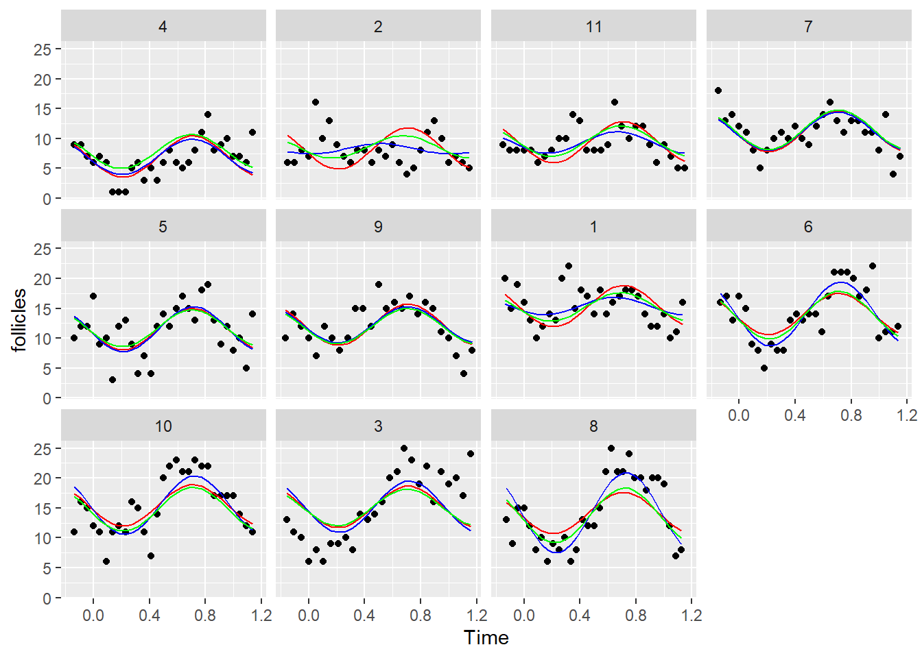
It does have an effect although it is not very large.
Exercise 8.3
- Extract the covariance matrices for the full model and the residuals from
lmm2.car, visualize them and discuss them (remember to usenlraa::var_cov()). - Estimate the fixed effects and the standard errors for the AR1 model and compare them to the output of
summary(lmm2.car).
Solution 8.3
- We use the function
var_covto extract the covariance matrices:
library(nlraa)
Attaching package: 'nlraa'The following object is masked from 'package:lattice':
barleyV <- var_cov(lmm2.car , type="all", aug=T)
image(round(V[1:50,1:50],3))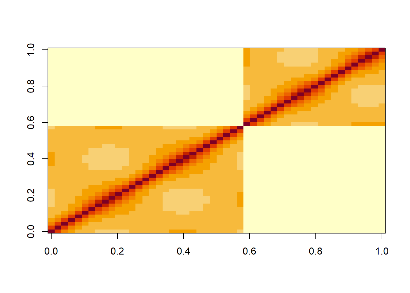
R <- var_cov(lmm2.car, type="residual", aug=T)
image(round(R[1:50,1:50],3))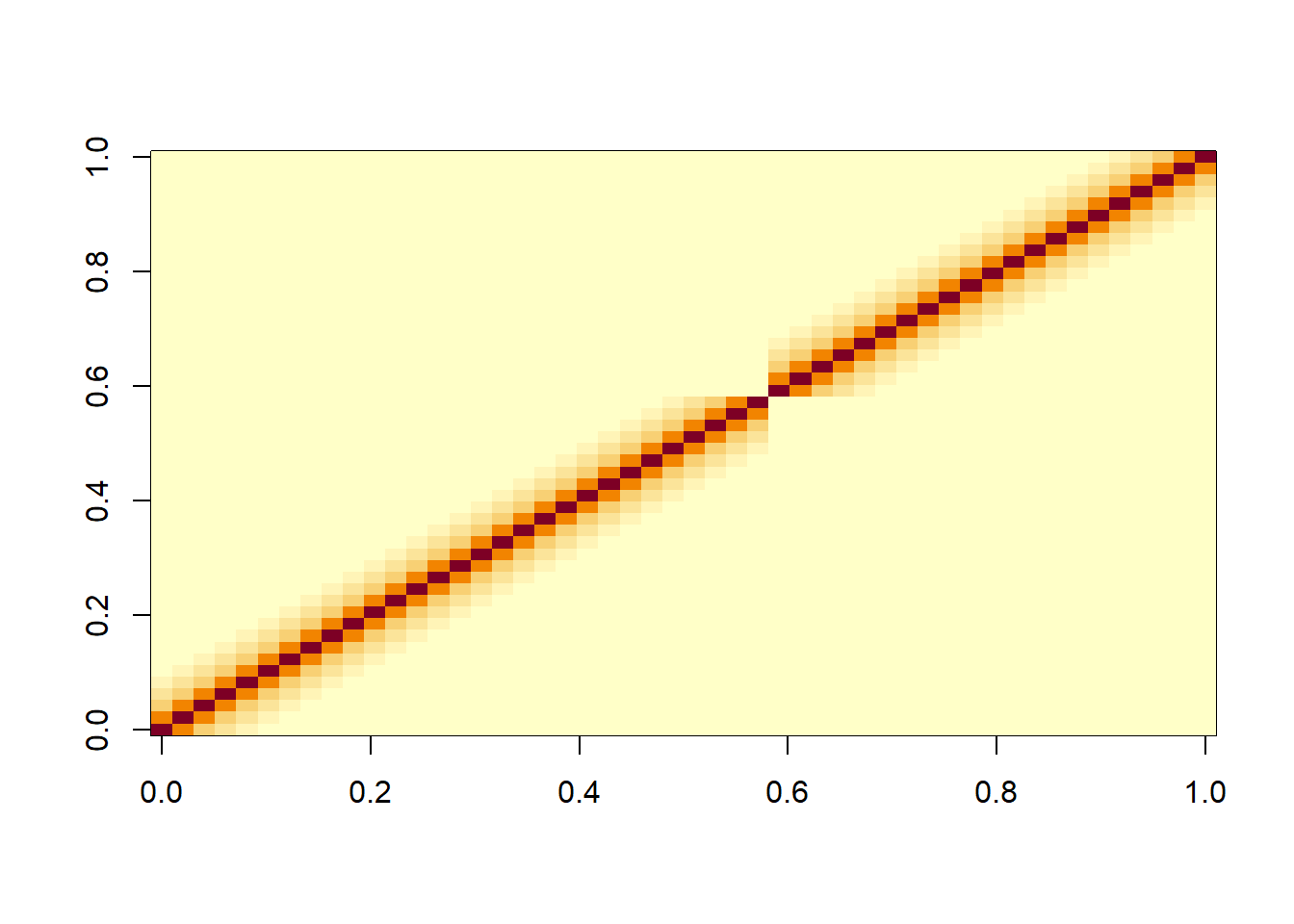
We can see that in the residuals there is a clear pattern of decreasing correlations when one moves away from the diagonal either along a column or row in the matrix. This reflects the autocorrelation in the residuals that we saw above with the ACF plot. In V we also the nested structure of the data due to the random effect of Mare.
- Let’s estimate the fixed effects and standard errors using the linear algebra formulae:
X <- model.matrix(lmm2.car, data = Ovary)
y <- Ovary$follicles
V_inv <- solve(V)

# Coefficient estimates
coef <- solve(t(X)%*%V_inv%*%X)%*%t(X)%*%V_inv%*%y
cbind(coef, summary(lmm2.car)$coefficients$fixed)
[,1] [,2]
(Intercept) 12.1880885 12.1880885
sin(2 * pi * Time) -2.9852973 -2.9852973
cos(2 * pi * Time) -0.8777618 -0.8777618# Standard errors
se <- sqrt(diag(solve(t(X)%*%V_inv%*%X)))
cbind(se, sqrt(diag(summary(lmm2.car)$varFix))) se
(Intercept) 0.9436626 0.9436626
sin(2 * pi * Time) 0.6055970 0.6055970
cos(2 * pi * Time) 0.4777821 0.4777821